Objectives
Building effective data visualisation helps an audience anyalse, understand and draw conclusions from summarised data.
Charts in Excel
Open the following file for use in this lab.
The first tab is a sheet called Intro to Chart Navigation, go to this tab and click on the chart. When you click on a chart the associated data is highlighted.
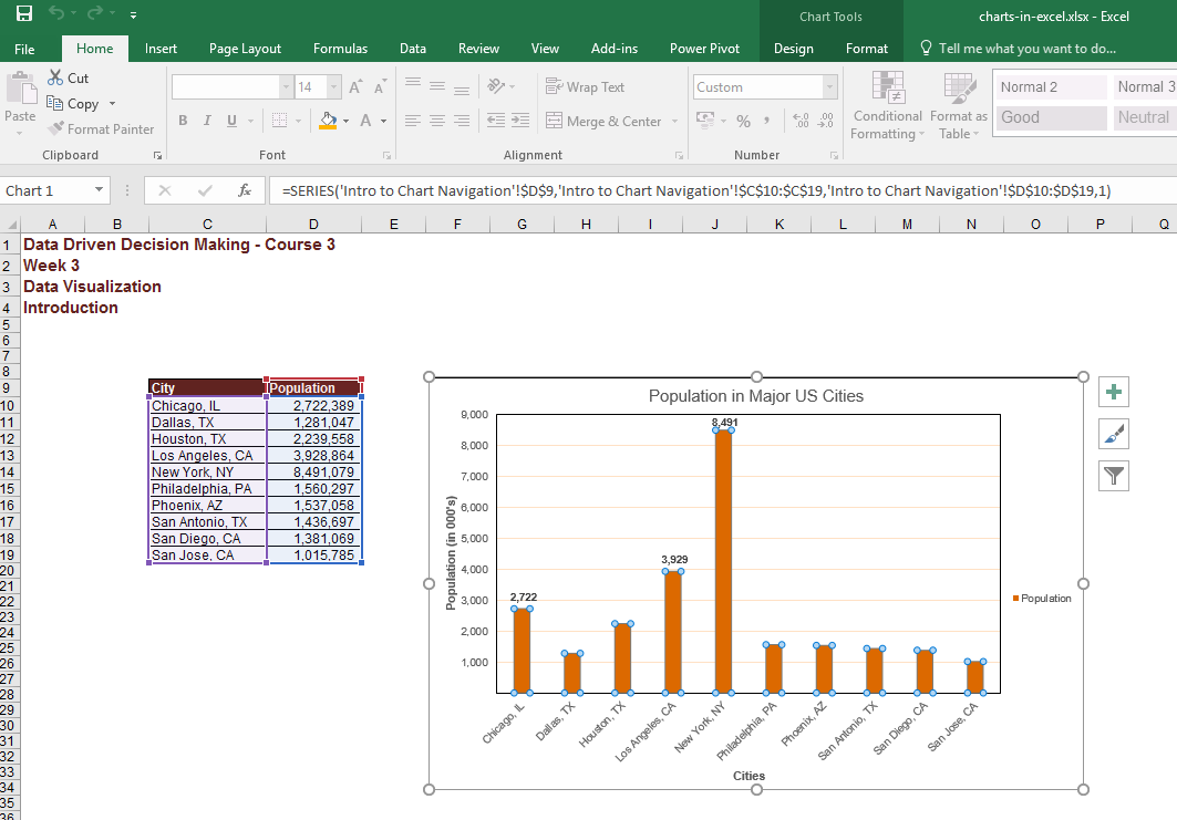
You can also see that the Chart tools ribbon has been activated. The first tab in the chart tools ribbon is the design tab, you can change the layout of a chart, alter the style of the chart such as colours, the data section allows you to manipulate the data set the chart is based on, and the location section provides options for moving the chart to another sheet.
Next is the format tab, it provides you with a variety of options for formatting the chart elements. The current selection section displays which chart element has been selected for formatting.

Here you can use the drop down menu to select some other chart element, for example you can select Legend, you should then see the Legend selected in the chart.
The Insert shapes section provides you with the option of inserting an object into the worksheet. Let's insert an arrow to point at the bar for New York since it is the city with the largest population.
You can change the style in terms of layout, colour fill, outline colour, shadows etc.
There are seven basic elements in an Excel chart.
- Chart area: this encompasses all of the other elements, when it is selected we can easily move the chart by clicking on it and dragging it to a new position within the worksheet. We can also resize the chart by grabbing the edge, remember the importance of balance with the aspect ratio of a chart when resizing.
- Plot area: contains the data points, you can move and resize the plot area, you cannot place the plot area outside the chart area.
- Data points: data series plotted on the chart. Click on a bar and all of the series are highlighted, click again if you want to change one data series.
- Axis: horizontal and vertical axis, both can be formatted.
- Legend: provides an overview of the data series being plotted.
- Title: chart and axis titles.
- Data Labels: help identify the details for each of your data points.
Try adjusting chart so that it looks like this:

Using a Column Chart
Open the Exercise1 tab.
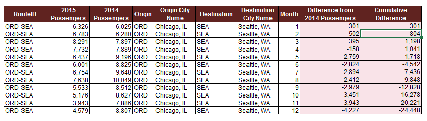
Let's look at how to use column charts. We want to look at the routes that have had the biggest change in passenger capacity in the last year.
The first two columns of the table contain the FlightID and a RouteID which identify the flight and route flown by that flight. The following two columns provide the Passenger Volumes for both 2014 and 2015. We're going to use the last column that is currently empty to calculate the percentage change in passenger volume between 2014 and 2015.
The first question in this exercise asks us to calculate the change percentage in column G. The formula to calculate this value is going to be passenger volume in 2015 minus the passenger volume in 2014 divided by the total passenger volume for 2014.
=(F15-E15)/E15)We can now see that for flight number 9, the passenger volume increased by 20% between 2014 and 2015. Now that we have validated that our formula works correctly, let's go ahead and copy it down the rest of the table. The order of the data in this table will be replicated in a graph. Therefore we're going to want to sort the data before creating the graph. To do this, we're going to select cell G14. And navigate to the editing section on the home tab. Next, we click on the sort and filter button. And select sort a through z from the menu. As you can see, the Chicago to Seattle route has experienced the largest decrease in passenger volumes.
Remember the charting principles that we discussed previously. Less data helps you send a clearer message to the audience. Our focus here is on determining the routes for which the passenger volumes have changed the most. Hence, we don't need to include the data that is in column C, E, or F in our chart. So let's go ahead and select the two columns that we're interested in by holding down the Ctrl key, and selecting the values in column D and G. Once the data has been selected, we're going to click on the Insert tab on the ribbon, and select the Recommended Charts option. From here, we select the clustered column chart, which creates our graph.
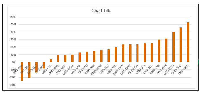
We’re going to spend some time formatting this chart so that it conveys the message that we're trying to share with our audience. First, let’s move the chart so that it is no longer on top of the data table. We do this by clicking on the chart and dragging it into the desired position.
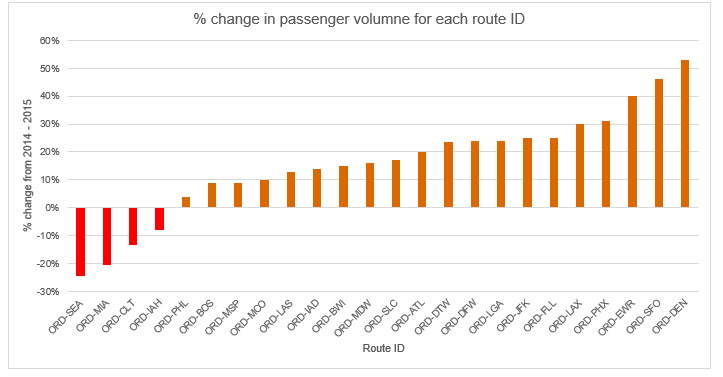
Next, we are going to change the title of our chart to something that is more descriptive of what is being shown. Let's click on the title, select the placeholder text, and replace it with "% change in passenger volume for each route ID".
We also want to make sure that we adjust the positioning of the axis labels, so that they become legible to the audience. To do this, we're going to right click on the horizontal axis. And select the Format Axis option from the menu. In the Format Axis panel, we're going to scroll down and expand the Labels category.
Next, we click on the Label Position drop-down and select Low. As you can see, the axis labels are now below the negative outcomes making the route IDs easier to read. We are also going to add titles to the horizontal and vertical axes. This is done by clicking on a chart, going to design tab, and selecting the add chart element option. We click on access titles and then we select a primary horizontal. In the primary vertical options.
To edit the axis titles we just created, we're going to click on the box for the horizontal axis title, and replace the text with route ID. Same thing for the vertical axis.
Let's click on the title. And replace it with, % change from 2014 to 2015. It would also be helpful to change the colors of the bars to helps us distinguish between the positive and the negative changes in passenger volumes. To do this we're going to click one of the bars in order to select the data series. Now that we have selected the bars representing the negative changes, we're going to bring up the format data point panel by right clicking on our selection.
We're going to click on the fill option and select a shade of red from the drop down menu to represent the fact that these are decreases in passenger volumes. We now have a column chart that shows us the changes in passenger volumes between 2014 and 2015 across all routes. We can see that despite a couple of routes losing passengers, overall, most routes increased their passenger volumes between 2014 and 2015.
Combo chart
In Exercise two, we are going to look at combo charts in more detail. We're being asked to analyze the passenger volumes for the Chicago to Seattle route in order to determine whether a new competitor who entered the market in March of 2015 has affected our sales. Based on the results of our analysis, the marketing department will be able to decide whether or not it's necessary to launch an expensive marketing campaign to retain our customers.
We have been given a dataset with the monthly passenger volumes on the Chicago to Seattle route for both 2014 and 2015. Using this data, we're going to determine whether the entry of a new competitor into the market in March 2015 has effected the overall passenger volumes. To fully understand how this route has been effected by the change of the market, we're going to look at the difference in passenger volumes between 2014 and 2015 on a monthly basis as well as their cumulative differences, since this will help us understand the net effect of the changes as well as reducing some of the noise from the monthly data points.
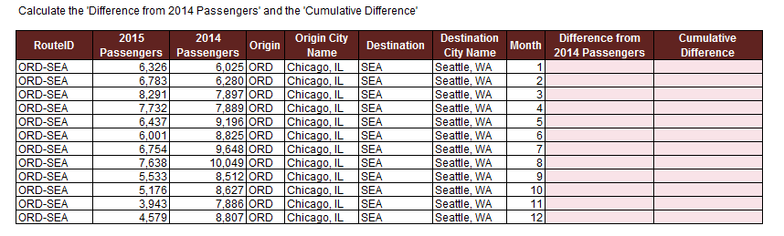
Let's start this exercise by completing the fields in column K and L in the data table. We will start with the difference from 2014 in column K. In cell K17 type:
= D17-E17Copy the formula down to the last row. We can already see that there was definitely a change in the overall trends somewhere in April. The passenger volumes were slightly higher in 2015 than in 2014 for January, February and March. However, in April, this train reversed and the passenger volumes were a lot lower than the previous year for the remaining months. It definitely looks like the new competitor affected our passenger volumes. So let's finish with our cumulative difference, so that we can start plotting these values.
In cell L17 type:
=K17The cumulative difference for the current month is going to be equal to the cumulative difference from the previous month plus the volume difference for the current month. In cell L18 type:
=L17+K18This formula applies for the remaining months of the year, so let's copy it down the table. As we can see, the cumulative difference in passenger volumes went up in the beginning of the year, but started decreasing in April and went negative the following month.
Now that we have our data and already see some worrying trends, let's focus on how we're going to present this analysis to our audience. We want to create a chart that allows us to show both monthly differences in passenger volumes, as well as the cumulative difference over the year.
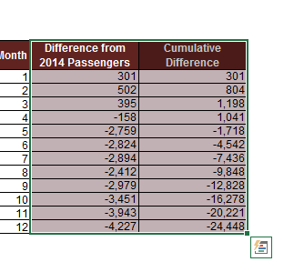
This type of data is best shown using a Combo Chart. We're going to start by selecting the two sets of data that we want to plot, which is going to be the data in columns K and L that we just filled out. Note that we're not including the route information since this is constant across our data points and wouldn't be adding anything to the chart. So let's go ahead and select the two columns with the monthly difference and cumulative difference in passenger volume, making sure we select the headers of our dataset.
Once the data is selected, let's navigate to the Insert tab on the Excel ribbon where we're going to click on the Combo Chart button and then click on the create custom Combo Chart option. We want the monthly differences to be plotted as a clustered column chart whereas we want the cumulative differences to be plotted as a line chart to show the trends over the year.
The data points for the cumulative differences go from positive 5,000 to negative 24,000, but the data points for the monthly differences only go from positive 800 to negative 4,000. So, it doesn't make sense to plot them on the same axis. Hence, we're going to select the check box for the secondary axis for the cumulative differences.
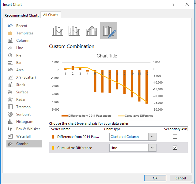
Now that we have provided all the required input, let's select OK to create our Combo Chart. We can see on this chart that something happened in the March to April time frame that completely changed the trend for the passenger volumes. Now the question is how can we make it easier for our audience to draw the same conclusion from this data?
As discussed this week in lectures, we can improve our chart by formatting it to emphasis the story that we are trying to tell. Let's start by changing the title of the chart. To do this, we're going to select the placeholder text and replace it with O'Hare, O-R-D to Seattle, SEA Passenger Variance from 2014 to 2015.
Next, we're going to adjust the positioning of the axis labels. Let's right-click on the Y-axis and select Format Axis from the menu. In the pop-up window, expand the labels category. Click on the label position drop-down and select low. Once we close this pop-up, we can see the adjustment. We also want to make sure our axis have titles to make the chart easier to read. Since there are currently no axis titles, we're going to need to add a chart element to our chart. So, let's click on our chart and navigate to the design tab on the ribbon where we click on the Add Chart Element button.
We want to add axis titles, so let's select that from the menu, then we are going to click on the Primary Horizontal and Primary Vertical options. Note that this chart has two vertical axis, so let's make sure we also add the secondary vertical axis. Next, we are going to add each of the axis titles. Lets start by selecting the place order text for the horizontal axis and replacing it with month. Next, we'll do the title for the axis on the left side of the graph. So, let's go ahead and select the placeholder text and replace it with 2014 to 2015 variants. Finally, let's select the placeholder text for the final vertical axis title and replace it with 2014 to 2015 cumulative variants.
We're going to add data labels by clicking on the chart and navigating to the design tab again. Let's click on the Add Chart Element button. Select Data Labels and click on More Data Options. As you can see, there are multiple layer options available to us. We're going to select the Outside End as the label position and then we close the pop-up window. Since the chart is kind of small, the labels are a bit hard to read. So, lets make the chart slightly larger by clicking on the border of the chart and using the corner to re size it. Generally, grid lines are not necessary when data labels are displayed. So let's go ahead and remove them from the chart since it will provide a cleaner look, and view. We're going to do this by clicking on the graph and selecting the plus button on the top right side. This brings up the chart elements menu where we are going to unselect the grid lines option.
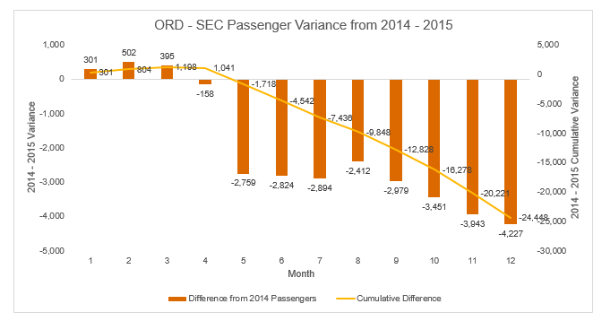
Our graph answers the question asked by the CEO. The entry of a competitor into the market in March of 2015 clearly impacted our passenger volumes negatively. This chart can now be used by the marketing department to build a business case for creating an aggressive marketing campaign to retain our customers. After creating a graph, always revisit the message that you're trying to convey. This graph shows the passenger difference throughout the year in a bar graph, and a cumulative difference in a line graph.
Does the graph show a correlation with the competitor's entry into the market? It does. Remember though, take the findings with a grain of salt. Though there may be a correlation, we cannot say for certain that the competitor's entry is the cause for the passenger variance.
Stacked chart
In exercise three, we're going to look at stacked column charts in more detail. We're being asked to review the average delay times on the Boston to Chicago route and see how it compares to our competitors. We've been given data for the average delays on that route for our airline as well as for its main four competitors. We're going to create a chart using this data that allows us to show how we're performing compared to the other airlines.
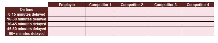
Let's start by taking a closer look at the data that we have been given. The table splits up the delay times into six different buckets, starting at on time and ending with flights that were delayed over an hour. For each of the airlines, we can see how many of their flights fell into each of these buckets. Now it's important to note that the airline that has the most flights that fall into the 60 plus minutes bucket isn't necessarily the worst airline, since it may just be that this particular company has many more flights than the others. Hence, we will need to normalize the data using percentages in order for us to be able to compare the different players. So now that we have determined that we're going to have to transform the numbers we have been given into percentages, we're going to complete the table below.
First, we're going to need to calculate the total number of flights per airline. And then we can use those totals to determine what percentage of that airline's flights fell within each of the buckets. We're going to put the total number of flights for each airline in row 18.
=sum(D12:D17)Now that we have the total number of flights for our employer, we can copy this formula to the right to obtain the totals for the other airlines. Now that we have the total number of flights for each airline, we can calculate the percentages for each of the buckets.
We're going to use the table below to do this. We want to know what percentage of our flights are on time.
So we're going to select cell D21 and type:
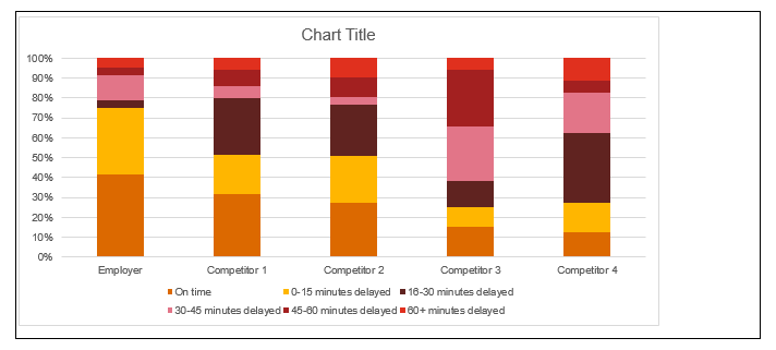
=D12/$D$18As we can see, 42 percent of our flights are on time on the Boston to Chicago route. Copy this formula down the rest of the column. The total of the percentages in column D equals 100%. We've confirmed that our formula works. So let's copy it out to the right to complete the table. Now that we have all of our data ready, it's time to build our chart. Select this entire table and then navigate to the insert tab on the Excel ribbon. We've determined that we want a stacked column chart. So let's click on the column chart button in the chart section. We are working with percentages, so we're going to select the 100% stacked column chart option.
The chart shows the delay times on the horizontal axis. We can change this by selecting the chart and going to the Design tab on the ribbon and selecting the Switch Row/Column button on the data section. We have successfully created the chart, however it is definitely not ready for presentation yet. So let's spend some time applying everything that we have learned about formatting so that it provides a clear and concise answer to the CEO's question.
For example, we should add a clear and descriptive title to the graph and we should change the color scheme to be more meaningful. Let's start by giving our new chart a title. We want to give it a descriptive name, so let's select the placeholder text, and then we're going to rename it, "Comparison of Delay Times Between Airlines for the Boston to Chicago Route".
Next, we're going to add some access labels to our new chart. We select the chart and navigate to the Design tab, where we click on Add Chart Element. Since the airline name on the horizontal axis are pretty self-explanatory, we only need to add an axis title for the vertical axis. So we're going to select Axis Titles, and then Primary Vertical.
Now we just have to edit the text of the title we created. So let's select the placeholder text and replace it with "percentage of each delay time category". In this chart, the legend is very important since it shows the user different buckets for the delays that we are representing on the chart. So in order to place emphasis on the importance of the legend, we're going to place it to the right of the chart. To do this, we're going to right-click on the chart legend in order to bring up the formatting menu. We want to format the legend, so let's go ahead and select Format Legend in the menu. This brings a pop-up with a variety of formatting options, including Legend Positions. We want it to be to the right, so let's select that option and then close the pop-up window. As we can see, the legend is now on the right side of the chart.
The current color scheme isn't very representative of the delay times. So let's make the chart easier to read by using more appropriate colors for the different delay buckets. We can use green for the on-time flights, and gradually transition to red for the flights that are delayed over an hour. Let's start with the on-time bucket. In order to change the color of this series, we're going to right click on one of the elements of the series, which brings up a menu where we can select format data series. We want to change the color, so let's expand the fill category and then click on the color drop down. Since we're working on the on-time bucket, we're going to pick green. If we close the pop-up window, we can see that the first bar has now become green. Next, let's do the 0 to 15 minute delay bucket.
Just like before, we right click on one of the elements in the data series, and bring up the formatting menu by selecting format data series in the menu. In the pop-up window, we go to the fill section, where we select a light shade of green. But instead of closing the window, we're going to keep it open to enable us to continue editing the remaining buckets. As you can see, our pop-up window now let's us edit this data series. We're going to select a light shade of yellow for this bucket, since it represents the 16 to 30 minute delays. Next, still keeping the pop-up window open, we select the fourth bucket. For this data series, we're going to select a yellow fill. Notice how our chart is updating automatically every time we pick a new color. So let's do the second to last bucket, which is going to be orange. Once more, we click on an element in the data series, and then we select orange under the color fill menu
Finally, we select the 60+ minute delayed bucket. We're going to use red for this one. So let's go ahead and select red from the color fill menu. Now that we're done with formatting our colors, we can close our pop-up window. Notice how we have used the color tone in graduation to highlight the severity of the delays and their impact. This makes the message of this chart clear and efficient.
Now that we have successfully formatted our graph, it is easy to see how our airline compares against its competitors. Notice how our airline has about 75% of flights that arrive on-time or with less than a 15 minute delay. This is a great statistic, especially if we compare this to competitors, who can only claim a 50% success rate. This is the type of message that we want to relay to our marketing team.
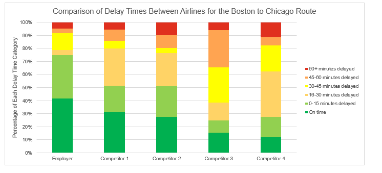
They now have the data to support a marketing campaign boasting their on-time flights for this route to hopefully recuperate some of the lost passengers.